


Defined in Control.Def
Inherits from Meter
Your users will see many choice boxes in their interactions with Magic Cap. They'll use a choice box to navigate through tool palettes. They'll use a choice box as a part of a Drawers object to select stamp categories. They'll use a choice box to select how a telecard is delivered. And you'll use choice boxes often when you need to allow your users to choose from a list of predetermined possibilities.
Remember that if the documentation and the software (especially the definition files) disagree, always trust the software.
Get your choice box objects from the Magic Hat, in the "choices" drawer of the components palette. You will probably want to customize your choice boxes by dumping their text descriptions to an object definition file and then editing the fields by hand.
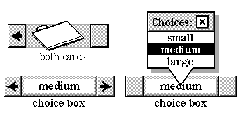
Choice boxes have two selection modes: pop-up list visible and pop-up list invisible. The illustration at the beginning of this chapter shows a choice box in both modes. By default, the choice box first appears with the pop-up list invisible, and the arrows at either side active. The user makes her selection by using the arrows to browse through the choices. The visible choice is the current, selected choice. The user can display the pop-up list by tapping the box displaying the current choice. The system then hides the control arrows and displays a choice box list window, which contains all of the possible choices. The user now makes her selection by tapping a choice name. The system then hides the list window and reactivates the control arrows.
Some choice boxes don't have a predetermined list of choices. These choice boxes don't display the choice list when the user taps in the center area, and so don't draw the center area in a touch-inviting manner. Month choice boxes work this way.
If the choice list is nilObject, the choice box is displayed in a nonoperative manner. Specifically, the list window won't appear in response to a user tap, and the center area is not drawn with the touch-inviting frame. The user must tap the arrows to make a choice. This mode is useful for choice boxes that present too many choices for reasonable display in a list window. Month choice boxes are displayed in this manner, since the range of chooseable months is, after all, infinite.
You can set your choice box to create a list of choices on the fly or to present named choices from text you supply. You can use an object list as the source of your choices.
If the concept of a first and a last choice doesn't make sense for a particular group of choices, you can set the choice box to wrap. You can allow your users to select a "none of the above" choice (using the subclass ComputedChoiceBox), or to fill in an "other" field with a custom choice.
You might want to create your own subclass if you require any special processing to create your choice list. For example, the MonthChoiceBox subclass overrides several methods to present a list of months as choices.
Instantiate: often
Subclass: sometimes
Call its methods: rarely
You'll rarely call any of the methods of the ChoiceBox class yourself, though you will probably override some of them if you create a subclass. You will most likely edit the choice flags, choices, target, and target attribute fields of a choice box instance definition in your object definition file. The two examples in this section show some common choice box configurations.
Here's an example of a simple choice box used in the date book. Users can select the confirmation status of a meeting using this choice box.
Instance ChoiceBox 'status' 3107;
           next: nilObject;
       previous: (ChoiceBox 'priority' 4702);
      superview: (GadgetWindow 'Alarm and other details' 5265);
        subview: nilObject;
 relativeOrigin: <22.0,50.0>;
    contentSize: <174.0,28.0>;
      viewFlags: 0x101B1000;
     labelStyle: iBook12;
          color: 0xFF000000;
       altColor: 0xFF333333;
         shadow: nilObject;
          sound: iTouchSound;
         border: iBorderBlack1;
          image: nilObject;
      textStyle: iBook12;
   controlFlags: 0x35008000;
          level: 0.0;
            min: 0.0;
            max: 1.0;
         target: iCurrentTask;
targetAttribute: operation_Uncertainty;
   upDownImages: iChoiceBoxRightArrow;
        choices: (Text 3108);
    choiceFlags: 0;
End Instance;

Instance Text 3108;
           text: 'confirmed\ntentative';
End Instance;
This particular choice box doesn't set any choice flags, and therefore uses a no-frills choice box. The level field contains the level of the default choice presented to the user. In this case, the minimum level"confirmed"is the default. The possible levels should correspond to the target attribute numbers. In this example, Uncertainty is a boolean attribute. Therefore 0 means "uncertain" and 1 means "not uncertain" (which translates to "certain" for nonprogramming not unpeople). So this example uses 1.0 as a maximum level.
The target of this choice box is the indexical iCurrentTask. The target attribute is the operation Uncertainty. So when the user changes the status of her meeting by tapping a selection from this choice box, the system calls the SetUncertainty method of the current task, with the new value parameter set to the choice box's level. The system first converts this value from a fixed number to the appropriate type. In this example, the appropriate type is Boolean.
The choices field points to a Text object that contains a "\n" delimited list of choice names, from min to max.
The choices field could also point to an object list. Here's an example of how you might use an object list:
Instance ChoiceBox 20
           next: nilObject;
       previous: nilObject;
      superview: (Drawers 'components' 3243);
        subview: nilObject;
 relativeOrigin: <0.0,85.0>;
    contentSize: <116.0,25.0>;
      viewFlags: 0x10081100;
     labelStyle: iSign8;
          color: 0xFF000000;
       altColor: 0xFF333333;
         shadow: nilObject;
          sound: iTouchSound;
         border: iBorderBlack1;
          image: nilObject;
      textStyle: iBook12Bold;
   controlFlags: 0x35008000;
          level: 1.0;
            min: 1.0;
            max: 1.0;
         target: (Drawers 'components' 3243);
targetAttribute: operation_Index;
   upDownImages: iChoiceBoxRightArrow;
        choices: (ObjectList 21);
    choiceFlags: 0x0B800000;
End Instance;

Instance ObjectList 21;
         length: 1;
          entry: (ObjectList 'main' 22);
          entry: (ObjectList 'more' 23);
End Instance;
This choice box sets four choice flags: choiceObjectsMask, useObjectIndexMask, choiceWrapMask, and maxFromChoicesMask. Because the choice objects flags is set, this choice box must have an object list in its choices field. The useObjectIndexMask enforces the use of the object indices as levels. Notice that the min and max fields are both set to 1. These settings would not produce useful results without the maxFromChoices flag.
See the section on choice flags later in this chapter for a complete list of possible flags.
The ChoiceBox class has the following methods you might call:
| Method | Description |
|---|---|
| ItemSelected | Handle case when user selects item from pop-up list |
| MenuShowing | Return true if the pop-up list is visible |
| LevelText | Return a text version of the current choice |
| SetLevelText | Convert a text object into a choice value |
| TextFromValue | Construct a text string for the current choice |
| Max | Return the number of possible choices (which is the maximum level setting) |
| PushLevel | Set the target attribute of the controlled object to the selected choice |
| SetLevel | Redraw the control to display the new level |
| UpdateLevel | Update the choice box to reflect a new selection |
| ValueInString | Return true if the choices are from a text list |
| ValueString | Return a string containing the text associated with the given level |
| AdjustSize | Adjust the size of the box to fit the longest choice name |
| ControlsActive | Return true if the pop-up list is invisible |
| ControlsWrap | Return true if choices wrap from min to max |
| Choices | Return the contents of the choices field |
| SetChoices | Set the choices field to point to a new choice list |
| Selected | Return the object corresponding to the current selection |
| SetSelected | Set the current selection to the given object |
Whenever you create a subclass of the ChoiceBox class, you might override the following methods:
| Method | When to override |
|---|---|
| AboutToHide | If your subclass object needs to do any cleanup |
| AboutToShow | If your subclass object needs to do any preparation before displaying itself |
| BumpValue | If you want to change what happens when the user taps or option-taps the up/down images of the choice box |
| DrawControlMechanism | If your subclass should draw itself differently from the usual choice box |
The ChoiceBox class defines the following fields:
| Field | Type | Description |
|---|---|---|
| Inherited from SingleLinkable | ||
| next | Object | Next item in view list |
| Inherited from Linkable | ||
| previous | Object | Previous item in view list |
| superview | Viewable | Container for this object |
| subview | Viewable | Object contained by this object |
| relativeOrigin | Dot | Origin relative to superview |
| contentSize | Dot | Size of content rectangle |
| viewFlags | Flags | Property settings |
| labelStyle | TextStyle | Text style of object's label |
| color | Unsigned | Color of object's content |
| altColor | Unsigned | Alternative color for object |
| shadow | Shadow | Shadow drawn with object |
| sound | Sound | Sound associated with object |
| Inherited from HasBorder | ||
| border | Border | Frame drawn around control |
| Inherited from Control | ||
| image | Image | Image used to draw control |
| textStyle | TextStyle | Text style used for control's label |
| controlFlags | Unsigned | Various settings for control |
| level | Fixed | Current setting of control |
| min | Fixed | Minimum setting allowed for control |
| max | Fixed | Maximum setting allowed for control |
| target | Object | Object watched and controlled by control |
| targetAttribute | Unsigned | Selected attribute of watched object |
| Inherited from Meter | ||
| upDownImages | Object | The image used for changing the setting; a small right arrow by default |
| Defined by ChoiceBox | ||
| choices | Object | The list of available choices |
| choiceFlags | Flags | Various settings for the choice box |
You might want to consider using one of the provided subclasses of the ChoiceBox class.
Use a ComputedChoiceBox object to add a "none of the above" choice to the choice list, or to transform the choice list in some way that you define.
Use an ImageChoiceBox object when your choices are best presented as images instead of text. This subclass displays a small image instead of a text name. (There's an example in the illustration at the beginning of this chapter. That particular example is visible whenever you file messages from your in box.)
Use a StyleChoiceBox object when the choices are style coupons (text styles, line styles, and so on).
Use the following flags in the choiceFlags field to control various choice box behaviors.
#define lastOneEditableMask 0x40000000
Set this flag when you'd like the last choice in the list to be an "other" choice, editable by the user. If none of the presented choices are quite what the user wants, he or she can fill in a more appropriate option.
#define resetValueMask 0x20000000
Set this flag when you'd like the minimum or first choice to be the default choice, displayed as selected when the choice box is first presented to the user.
#define transientChoicesMask 0x10000000
Set this flag when your choice list is dynamic; that is, if the list of possible choices can change. If this flag is set, a choice list is created whenever the choice box is about to be shown, and destroyed when it is about to be hidden. You will probably also want to use the maxFromChoicesMask with this flag.
#define choiceObjectsMask 0x08000000
Set this flag when your possible choices are objects, and the choices field points to an object list.
#define useObjectIndexMask 0x02000000
You'll use this flag often with the choiceObjects flag, and when the choices field points to an object list. When set, the index of the object is used as the choice box value. (When the useObjectIndex bit isn't set and the choicesObjects bit is, the choice box uses the object itself as the value passed to SetAttribute.)
#define choiceWrapMask x01000000
Set this flag when you'd like your list of choices to wrap around instead of pinning at its maximum or minimum.
#define maxFromChoicesMask 0x00800000
Set this flag when you need to compute the maximum level by counting the choice list. This flag is useful if your choice list is mutable and changeable, such as when you've set the transient choices flag.
#define useObjectAttributeMask x00400000
Set this flag to use the target attribute of the selected object as the current value. The following illustration shows an example of a choice box that sets this flag:
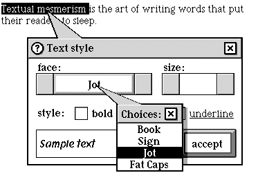
Here's the instance definition for this choice box:
Instance ChoiceBox 'face:' 9428;
           next: (ChoiceBox 'size:' 9429);
       previous: nilObject;
      superview: (TextStyleWindow 'Text style' 9427);
        subview: nilObject;
 relativeOrigin: <-59.0,-39.0>;
    contentSize: <166.0,30.0>;
      viewFlags: 0x10111000;
     labelStyle: iBook12Bold;
          color: 0xFF000000;
       altColor: 0xFF333333;
         shadow: nilObject;
          sound: iTouchSound;
         border: iBorderBlack1;
          image: nilObject;
      textStyle: iBook12Bold;
   controlFlags: 0x35008000;
          level: 1.0;
            min: 1.0;
            max: 2.0;
         target: iEditTextStyle;
targetAttribute: operation_Face;
   upDownImages: iChoiceBoxRightArrow;
        choices: iTextStyleFaces;
    choiceFlags: 0x08C00000;
End Instance;

Instance ObjectList 9436; // iTextStyleFaces
         length: 4;
          entry: (TextStyle 'Book' 9437);
          entry: (TextStyle 'Sign' 9442);
          entry: (TextStyle 'Jot' 9506);
          entry: (TextStyle 'Fat Caps' 9507);
End Instance;
The choices for this choice box come from an object list, indexical iTextStyleFaces, which lists a number of text styles. When the user selects a text stylein this example, she is about to select Jotthe choice box sets the Face attribute. Because the useObjectAttribute flag is set, it calls the attribute setter with the face of the selection as the new attribute value.
The target's attribute in this example is set the same way this fragment sets
it:
newValue = Face(selectedTextStyle);
SetFace(iEditTextStyle, newValue);
The choice box's selection would be the selectedTextStyle parameter.
#define cbMatchWithSameChoice 0x00200000
When this flag is set, the system uses the SameChoice method to compare choice list elements with the attribute from the choice box's target.
Version note: Previous versions of the software named this mask cbIdentityFromNameMask.
#define neverAdjustBoxSizeMask 0x00100000
Set this flag to prevent AdjustSize from changing the choice box bounds.
#define cbLookForGroupMask 0x00080000
Set this flag to search for a group in the address cards stack that has a member list that matches the target attribute of the control.
#define allowNoneChoiceMask 0x00040000
Version note: This flag is now obsolete. If you'd like your users to choose none of the possibilities presented by your choice box, use the subclass ComputedChoiceBox.
#define numericTextMask 0x00001000
Set this flag to convert your choice list text to numeric attributes.
operation BumpValue(decrementFlag: Boolean): Fixed

Call: rarely
Override: rarely
When the pop-up list isn't visible, the user changes his choice by tapping the right and left arrows of the choice box. The system handles those taps by calling BumpValue.
BumpValue returns a "bump" amount: the amount by which to change the level of the choice box. When the option button is not down, BumpValue returns 1 if decrementFlag is true and 1 if it is false.
When the option button is pressed, the bump value is set to send the level to either the minimum setting (the first choice) or the maximum setting (the last choice). BumpValue returns the minimum value if the decrement flag is on, and the maximum if it is off.
You should override this method if you want option-tapping to have a different result, or if you'd like to do some extra work when the user taps. For example, you could dynamically compute the "next" value in the given direction.
operation ItemSelected(theIndex: UnsignedShort)

Call: rarely
Override: rarely
The systems calls ItemSelected when the user taps an item in the pop-up list window. theIndex is the selected item's position in the list. ItemSelected converts it to a level value. ItemSelected then calls PushLevel, hides the list window, and marks the choice box as dirty.
operation PushLevel(text: Object)

Call: rarely
Override: rarely
The system calls PushLevel to set the choice box to an initial selection just before it's displayed, and, more importantly, to handle changing the selection when the user taps a proffered choice. PushLevel calls its inherited method. See the description of Control_PushLevel for more details.
operation UpdateLevel

Call: rarely
Override: sometimes
The system calls UpdateLevel whenever the displayed value in the choice box might be stale, flat, and unprofitablefrom the AboutToShow, Idle, and PushLevel methods, for example. UpdateLevel checks the target and various flags to set the control's level to the appropriate value. You can trust that after an UpdateLevel call, your choice box will be fresh and up to date.
operation SetLevelText(text: Object)

Call: rarely
Override: rarely
SetLevelText turns a text object into a value as follows:
SetLevelText then calls SetLevel with the new value.
operation SetLevel(newValue: Fixed)

Call: rarely
Override: sometimes
If the user has chosen "other," SetLevel makes the first subview of the choice box visible and available for typing. It then calls its inherited SetLevel operation.
attribute Selected: Object, safe;
// operation Selected(): Object
// operation SetSelected(newSelected: Object)

Call: rarely
Override: rarely
Call Selected to get the object that the choice box currently displays. If the ChoiceObjects flag isn't set, Selected returns the nil object.
Call SetSelected to set the choice box's selection. Like Selected, SetSelected does nothing if the choices don't come from an object list.
If the choice box allows the "none" choice, and newSelection is nil, SetSelected sets the choice box to the "none" choice. Otherwise, SetSelected calls Search to find the index of an object in the choice list that matches newSelection. The index of the match is converted to a fixed value and is used as the new choice box level.
operation LevelText(): Object

Call: sometimes
Override: rarely
LevelText returns the text version of the current level setting, by calling TextFromValue.
operation TextFromValue(value: Fixed): Object

Call: rarely
Override: sometimes
TextFromValue returns a text object created from the string associated with the current choice. It creates the string by doing the following:
You might want to override TextFromValue to do some special processing to convert your choices to text objects.
operation ValueString(value: Fixed; resultString: Str255)

Call: rarely
Override: rarely
ValueString does exactly the same work that TextFromValue does, but returns a string instead of a Text object.
operation ValueInString: Boolean

Call: rarely
Override: rarely
ValueInString checks to see if the choiceObjects bits is set. If it is, the possible choices come from a list of objects, and ValueInString returns false. Otherwise, the choices are text choices, and ValueInString returns true.
operation AdjustSize()

Call: rarely
Override: rarely
AdjustSize sets the width of the choice box to accommodate the longest choice name, unless the neverAdjustBoxSize bit is set.
operation ControlsActive(): Boolean

Call: rarely
Override: rarely
Call ControlsActive to check if the choice box is showing. ControlsActive returns true if the choice menu is not showing, and false if it is. The choice box hides the right and left arrows when the user displays the menu, thus gently guiding him or her to select from the menu.
operation ControlsWrap: Boolean

Call: rarely
Override: rarely
ControlsWrap checks the choiceFlags field to see if the wrap mask bit is set. If it is, ControlsWrap returns true. Use choiceWrapMask if your choice box should wrap from its minimum to its maximum value and vice versa.
operation DrawControlMechanism(canvas: Object; clip: Object)

Call: rarely
Override: sometimes
DrawControlMechanism calls its inherited DrawControlMechanism and then draws the menu area in a touch-inviting manner. You should override this method if your subclass of the ChoiceBox class has a custom appearance. The ImageChoiceBox class is an example of a choice box with additional visual chrome.
attribute Choices: Object
// operation Choices(): Object
// operation SetChoices(newChoices: Object)

Call: rarely
Override: rarely
Call Choices to get the value of the choices field.
If newChoices and the choices field aren't already the same object, SetChoices sets the choice field to newChoices.
operation AboutToHide

Call: rarely
Override: rarely
AboutToHide cleans up the choice box before removing it from the screen. If the list window is visible, AboutToHide calls Disappear on it. If the choice box uses transient choices, AboutToHide destroys the transient choice list. Then it calls its inherited method.
operation AboutToShow

Call: rarely
Override: rarely
If the choice box uses transient choices, AboutToShow creates a new choice list by calling the target operation on the target object. It then sets the choice field to the ObjectID of the new choice list.
If the reset value flag is set, AboutToShow pushes the choice box level to the minimum value. Then it calls its inherited method.
operation MenuShowing(): Boolean

Call: rarely
Override: rarely
MenuShowing returns true if the target of the indexical iChoiceBoxListWindow is the current choice box, and if the list window is on the screen.
operation Max(): Fixed

Call: rarely
Override: rarely
Max computes the maximum level setting for the choice box. If the max from choices flag isn't set, Max simply calls its inherited method. Otherwise, Max counts the available choices (including the "none of the above" choice if it's allowed). Max returns the count.