


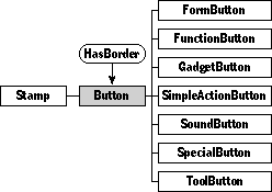
Defined in Button.Def
Inherits from Stamp, HasBorder
encodes empty field list;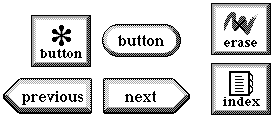
Class Button defines viewable objects that users touch to perform some action. Buttons have images that define their appearance on the screen. Buttons can be set to trigger their actions when the user first touches them or when the user releases the touch.
Remember that if the documentation and the software (especially the definition files) disagree, always trust the software.
You can use buttons in your package to provide users with a way to trigger actions, such as creating a new object, opening an auxiliary window, or moving to another scene. Most buttons should perform their action when the user touches and releases them. This gives the user a chance to correct a mistaken touch before the action takes place. For a few buttons, it's more appropriate to take the action immediately upon the user's touch.
Instantiate: often
Subclass: sometimes
Call its methods: rarely
If your package has buttons, you'll probably get them from the Magic Hat and add Magic Scripts for their actions. To write a script for a button, select the tinker tool and then option-tap the button. For complete documentation (or at least a good start at documentation) on writing Magic Scripts, see Magic Cap Concepts.
When a button's action is simple and expressible in a few lines of code, you should script the button. If a button's action is complex, you should consider instead creating a subclass of class Button and overriding the Action method.
You probably won't have to call methods of class Button from your package. You'll simply put buttons in place in your object definition files. Here's an example of a button definition that shows common values for most button fields:
Instance Button 'next' 367;
           next: (Button 'previous' 368);
       previous: (Button 'button' 366);
      superview: nilObject;
        subview: nilObject;
 relativeOrigin: <-7.0,66.0>;
    contentSize: <65.0,23.0>;
      viewFlags: 0x70103000;
     labelStyle: iLargeButtonStyle;
          color: 0xFF000000;
       altColor: 0xFF000000;
         shadow: nilObject;
          sound: iTouchSound;
          image: nilObject;
         border: iPointRightButtonImage;
End Instance;
This button uses the right-pointing border image, so it looks like a "next" or "move right" button. Without a script, though, this button does nothing.
Class Button defines the following methods:
| Method | When to override |
|---|---|
| AdjustSize | Overridden to also adjust the button's label size |
| AutoMove | Overridden to return false |
| Border | Overridden to use the next border in a linked list if the button is highlighted or disabled |
| SetBorder | Overridden to adjust the button's label location if necessary to accomodate the new border |
| CalcContentBox | Overridden to leave room for special button borders |
| CalcInsidePart | Overridden to delegate the call to Viewable if the button has no border (that is, it's just an image) |
| CalcLabelBox | Compute label's box for standard positions; override if subclass defines | nonstandard label positions |
| CalcOpaqueBox | Overridden to return an empty box if the button has no border |
| CanAcceptCoupon | Overridden to reject the "no border' coupon if the button has no image; otherwise, calls inherited; always returns true for image coupons |
| CanContain | Overridden to return false |
| CanDrawIn | Overridden to always return kDontDrawHere |
| CanStretch | Overridden to call Stamp_CanStretch if the button is just an image, and | to call Viewable_CanStretch if it's more than just an image |
| ContentSize | Overridden to delegate the call to Viewable if the button has no border |
| Draw | Overridden to draw the three pieces of the average button: the border, the l label, and the image |
| EraseablePiece | Return nilObject if self is current button; else returns self |
| Hilited | Check if object is highlighted (checks view flag) |
| SetHilited | Overridden to call the inherited method |
| ImageOrigin | Overridden to handle the various label locations |
| PartColor | Overridden to return colors for various parts of the button, such as the border |
| SetPartColor | Overridden to honk and do nothing if the part to be changed is the image (and the button has a border) |
| SetScript | Overridden to resize the new label, if the label is showing the script name |
| TimedAction | Overridden to call Action |
| Touch | Overridden to honk if the button's disabled, otherwise to highlight the button while the user's touch is over it |
When you create a subclass of class Button, you might override these methods under the following circumstances:
| Method | When to override |
|---|---|
| Action | Override to define the function of the button |
| Touch | Very rarely, you might need to add to the existing touch behavior |
| Draw | If your buttons draw more than just their images, or are highlighted in a special way |
Class Button inherits the following fields:
| Field | Type | Description |
|---|---|---|
| Inherited from SingleLinkable | ||
| next | Object | Next item in view list |
| Inherited from Linkable | ||
| previous | Object | Previous item in view list |
| Inherited from Viewable | ||
| superview | Viewable | Container for this object |
| subview | Viewable | Object contained by this object |
| relativeOrigin | Dot | Origin relative to superview |
| contentSize | Dot | Size of content rectangle |
| viewFlags | Unsigned | Property settings |
| labelStyle | TextStyle | Text style of object's label |
| color | Unsigned | Color of object's content |
| altColor | Unsigned | Not used by button |
| shadow | Shadow | Shadow drawn with object |
| sound | Sound | Sound associated with object |
| Inherited from Stamp | ||
| image | Image | Image used to draw stamp |
| Inherited from HasBorder | ||
| border | Border | The button's border |
The image field should contain the image that depicts the button in its normal state.
The border field should contain the border object that depicts the frame your button should have. The system defines a variety of button borders you can use. The following table gives the indexical names for those borders, together with pictures showing what they look like.
| Indexical | What the border looks like | When to use it |
|---|---|---|
| iStandardButtonBorderUp iStandardButtonBorderDown |
 |
For most buttons |
| iSquareButtonBorderUp iSquareButtonBorderDown |
 |
For special buttons; especially useful for groups of buttons that abut each other, such as a column of buttons along the right side of the screen |
| iRoundedButtonBorderUp iRoundedButtonBorderDown |
 |
For buttons that label a field or control |
| iPointLeftButtonImage |  |
For "previous" buttons |
| iPointRightButtonImage |  |
For "next" buttons |
| iAcceptBorderUp iAcceptBorderDown |
 |
For buttons that should be emphasized, such as the most important button in a group, or a "done" button |
| iKeypadButtonImage iPressedKeypadButtonImage |
 |
For keyboard buttons |
Some of the borders have two components, you'll notice: an "up" component and a "down" component. You don't have to specify both. Just use the "up" component in your button's border field. For example, to use the standard button border, use the iStandardButtonBorderUp indexical.
Magic Cap provides two button-specific label styles:
| Style name | Is the same as | Looks like this |
|---|---|---|
| iSquareButtonStyle | iBook10Bold |  |
| iLargeButtonStyle | iBook12 |  |
Use the square button style for square buttons, and the larger style for most other buttons.
Experiment with label locations to see which one works best for a particular button. The locations that place the label on the border generally look bad, but the locations below and to the right of the button might be useful.
Class SimpleActionButton is a class you should consider using instead of Button whenever you need a button that just calls one method. Other button classes you'll use often include SpecialButton, ModeButton, ToolButton, and GadgetButton.
Most of the methods of class Button are overrides of methods inherited from classes Stamp and Viewable, and aren't noteworthy. The only method you are likely to override often is Action.
operation Action

Call:  rarely
Override: often
The system calls the Action method of a button when the user taps it. The main Button class doesn't override this method, but you will often override it when you create a subclass. This method does the real work of the button.
Here's how the GadgetButton subclass defines Action:
Method void
GadgetButton_Action(ObjectID self)
   {
   ShowOrHide(Target(self));
   InheritedAction(self);
   }
This override allows gadget buttons to perform their major function: displaying their associated gadget windows.
Instead of overriding Action and creating a subclass of
Button, you could script a button object instead. See the
discussion in the programming section earlier in this chapter for
some hints on deciding when to script and when to override.