Fancy viewables
Book Contents Previous Chapter Next Chapter
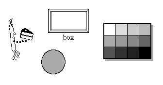
This chapter describes a few of Magic Cap's many classes of viewables. The classes described in this chapter are used for decoration and for organizing other objects visually. The information in this chapter is mainly intended to help you declare objects of these classes, although some information about calling methods and subclassing is also provided. Before reading this chapter, you should be familiar with viewables.
Because Magic Cap provides so many components for building user interfaces, it defines a large number of classes of viewables. Many of these viewables have important system functions (scenes, cards, windows) or provide a way to perform actions (buttons, controls, gadgets). This chapter describes a few of the other common viewable classes.

Fancy viewables
The classes discussed in this chapter are mainly used as organizers of other viewables (boxes, panels, scroll boxes) or are decorative and have no intrinsic function (animations, animals, shapes).
This section describes viewables that collect and organize other viewables on the screen. All of the viewables in this section are members of class Box, the fundamental organizing viewable.
Boxes
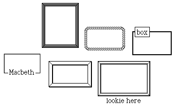
Class Box is defined simply as a viewable with a border. If you want to add a box to your package, you'll probably do so by getting one from the Magic Hat rather than defining one textually in your instance definition file. You can change a box's border by dropping a border coupon from the Magic Hat.

Choose-one boxes
Magic Cap defines choose-one boxes as boxes designed to contain switches, only one of which can be on at a time. When the user turns on a switch in a choose-one box, all other switches in the box are turned off.
Magic Cap does not provide a prototype choose-one box in the Magic Hat, but you can easily make one. To add a choose-one box to your package, get a standard box from the Magic Hat and customize its shape, name, border, and other settings however you wish. Then, add switches as subviews of the box, getting them from the Magic Hat if necessary. When the box and switches are complete, dump your package to text. Moving to CodeWarrior Magic, change the object's class from Box to ChooseOneBox. Be sure to change all references to the object, such as in the switches' superview fields.
When you rebuild the package with the new choose-one box, it will ensure that no more than one of its subviews is switched on at any time.

Color boxes
Magic Cap defines class ColorBox for color boxes that are divided into squares, with each square representing a color. When the user touches a square and then slides away, the color box creates a color coupon for the square's color. The user can then drop the coupon in any viewable that accepts color coupons to change its color.
Magic Cap provides a prototype color box in the Colors page of the Magic Hat. To add a color box to your package, just drop one from the Magic Hat. You can resize the color box with the stretch tool, changing the number of squares it contains. You can change a square in the color box by dropping a color coupon into it.
You can declare your own color box in your instance definition file. Color boxes have two more fields than boxes. The first, boxSize, indicates the size of one side of the squares inside the color box. The other field, colors, is a list of RGB color values that are used to draw the squares inside the color box.
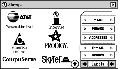
Mail labels at left are in a borderless scroll box
Magic Cap defines class ScrollBox for scroll boxes with contents that may not completely fit on the screen and so scroll their contents. If the contents of a scroll box can be fully displayed inside the box, the scroll arrows are invisible. Typically, scroll boxes have no border and so are invisible to users, as in the example shown above. See this book's Scrolling chapter for more information about scrolling viewables.
Magic Cap does not provide a prototype scroll box in the Magic Hat, but you can make one or copy an existing one from Magic Cap. To copy an existing scroll box in Magic Cap Simulator, choose the Can Move/Copy/Stretch Everything menu item. Use the copy tool to make a copy of a scroll box, such as the one in the e-mail stamp drawer in the name cards scene. This will also copy the scroll box's contents. You can remove them by sliding them to the trash with the move tool.
Scroll boxes inherit from boxes and scrollers and add five additional fields. The maximumSubviewBottom field is set by Magic Cap to the position of the lowest subview. Subviews in the scroll box are placed along a grid defined by the next two fields, gridSize and gridOffset. These fields specify the size of each position in the grid and the location where the grid begins, respectively. The topArrow and bottomArrow fields refer to scroll arrow objects used to scroll the box's contents.


The top and bottom of the screen are panels
Magic Cap defines class Panel as an abstract subclass of box. Panels are boxes that are usually invisible and intangible and are mainly used to hold other viewables. Class Panel overrides four features of boxes: panels don't accept other viewables dropped in, aren't brought to the front when touched, can't be moved, and can't show their labels. Because panels are so specialized, you probably won't ever create your own panel subclasses or objects, nor are you likely to call operations of panel objects.
Panels have three major sets of subclasses: scenes, bars, and the screen. Scenes, which contain virtually all the other viewables that appear in the space between the top and bottom of the screen, are a major part of Magic Cap's view architecture and are discussed in detail in this book's Scenes chapter.
Magic Cap has two bars, the name bar at the top of the screen and the control bar at the bottom of the screen. Bars do not accept coupons and can't be stretched.
Magic Cap has one object of class Screen, a viewable that represents the entire screen, including both bars and the scene between them. All objects on the screen are subviews of the screen (some of them nested inside other viewables).
Magic Cap provides many classes of viewables that are purely decorative and have no intrinsic function other than to improve the appearance of telecards, notebook pages, name cards, and so on. Three of these decorative viewable classes - animations, animals, and shapes - are described in this section.
Although these viewables are normally just for fun and don't perform any function, you can create scripts for them, as you can for any viewables, that let them perform some action.
Animations at rest
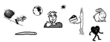
Magic Cap includes lively animations that walk, crawl, and bounce across the screen. Objects of class Animation include a series of images, each one depicting the object in a slightly different state. To make the animation move, the images are drawn and erased in succession. As each image is drawn, the location of the drawing can move, creating the appearance that the object is moving across the screen.
You can add animations to your packages by dropping them from the Magic Hat, or you can create your own animations. The rest of this section describes how you can control your animations by setting up their fields. All the fields mentioned have corresponding attributes, and many can be changed by using the tinker tool on the animation, as noted in the descriptions.
Your animation can have any number of different images. The images are stored as a view chain, with the animation's image field referring to the first one.
You can use the frameDelay field to have Magic Cap wait for a specified number of milliseconds before drawing the next animation frame (the next image in the chain). Similarly, you can use the cycleDelay to make Magic Cap wait for a specified number of milliseconds after all the animation's images have been drawn. You can control the frame delay with a meter in the tinker window.
Animations include a velocity that determines how far they should move before drawing the next image. The velocity is in the horizontalVelocity and verticalVelocity fields, either or both of which can be zero. You can set the horizontal and vertical velocity with meters in the tinker window.
Animations have an inMotion field which controls whether the animation uses its velocity to move across the screen. If inMotion is false, the animation will continue to flip through its frames, but it will not move across the screen. The moving check box in the tinker window controls the animation's inMotion value.
NOTE: A moving animation continues to move according to its velocity, even if its next frame is delayed by a frame or cycle delay. This can result in the same image being drawn repeatedly as the animation moves across the screen. Because of this, frame and cycle delays are most useful for animations with zero velocity.
Animations can be set to act in various ways when they reach an edge of their containers. You can use the canBounceHorizontally and canBounceVertically fields to set whether the animation turns around and bounces back when it reaches an edge. If either of these fields is false, the animation will wrap around the corresponding edge, jumping back to the opposite side. For example, if canBounceHorizontally is false and the animation reaches the right edge, it then jumps to the left edge. The hBounce and vBounce check boxes in the tinker window control the animation's "bounce" settings.
You can set your animation to flip its orientation when it reaches an edge of its container. Use the canFlipHorizontally and canFlipVertically fields to control this feature. If you've set one or both of the "bounce" fields described above, you'll usually set the corresponding "flip" field so that the animation's image is pointed in the right direction after it bounces away from its container's edge. The hFlipOK and vFlipOK check boxes in the tinker window control the animation's "flip" settings.
You can use the canTurnRight and canTurnLeft fields to set your animation to turn right or left instead of bouncing when it reaches its container's edge. If you set both "turn" fields to true, the animation will turn right when it reaches its container's edge. If you set either of the "turn" fields, you'll usually set the canRotate field, which changes the animation's orientation to keep the image pointed in the right direction after it turns. The turn right and turn left check boxes in the tinker window control the animation's "turn" settings.
You can use the oneShot field to set your animation to perform a cameo appearance, dancing across the screen once from the left edge to the right before vanishing into the wings. There is no attribute or tinker control that corresponds to the oneShot field.
If you set the canTouch field, Magic Cap will behave as if your animation is touching objects on the screen every time it moves. The touch generated by the animation will be handled just as if the user touched the screen in the same place. The meddle check box in the tinker window controls the animation's canTouch setting.
When an animation moves down a corridor, it normally continues past the visible edge of the corridor and off the screen. You can set the animation's dragAlong field to make the corridor scroll automatically so that the animation remains on the screen. There is no attribute or tinker control that corresponds to the dragAlong field.
You can use the soundTrack field to have your animation play a sound or song continuously while it appears on the screen. To use this features, set the animation's sound field to refer to the sound you want to play and set the soundTrack field to true. There is no attribute or tinker control that corresponds to the soundTrack field. Note that dropping a sound coupon on an animation sets its sound field, but doesn't change its soundTrack field.

Have you ever seen anything cuter?
Magic Cap defines animals as animated digital versions of their real-life counterparts. Class Animal is a subclass of BehaviorAnimation, which inherits from Animation.
You can define animals in your packages. Because animals are animations, you should set all of your animals' fields as you would for animations. Animals define several additional fields, as discussed in the rest of this section.
Every animal should have 10 different animation sequences, known as behaviors. Magic Cap defines the following behaviors for animals:
--------------------------------------------------------------------------------
behavior name  value  description
--------------------------------------------------------------------------------
walk           1      Animal is walking
run            2      Animal is running
stop           3      Animal is not moving
sleep          4      Animal is sleeping
sit down       5      Animal is seated
pick up        6      Animal has been picked up
gesture        7      Animal is responding to swallowing something
reply          8      Animal is responding to appearing or being touched by user
fall           9      Animal has been dropped after being picked up
wake up        10     Animal is waking up after being asleep

--------------------------------------------------------------------------------
Animals have a behavior field that describes which behavior they will exhibit when they first appear. Animals can switch to a new behavior at idle time once they've completed their current behavior, which changes the animation sequence that Magic Cap draws to show the animal. Magic Cap chooses the animal's new behavior by noting its current behavior, then making a random choice from a set of behaviors that might follow the current one. For example, if the animal is currently running, it will change to walking or stopped when it finishes running.
The following table shows the possible behavior transitions:
-----------------------------------------------------------------
current behavior   possible following behaviors
-----------------------------------------------------------------
walk               run, stop
run                stop, walk
stop               sit down, walk, run
sleep              wake up, sleep
sit down           sleep, walk, sit down
pick up            pick up; fall when touch is released
gesture            sit down
reply              sit down
fall               fall; stop if animal is at bottom of container
wake up            walk, sit down

-----------------------------------------------------------------
The animal's behaviorImages field refers to an object list of images, one for each behavior. Each image in this object list is the head of a view chain, with the views in each view chain forming the animation for that behavior. The behaviorDelays field refers to a data list of frame delays for each behavior's animation.
The behaviorSpeeds field refers to a data list of values used for the behaviors' velocities. The behaviorSpeeds elements are defined as values of type Dot. When you define animals in your instance definition file, you should use two comma-separated values in angle brackets to specify each behaviorSpeeds element. The first value in each pair gives the horizontal velocity, and the second value in each pair gives the vertical velocity. To specify the values in pixels, each must include a decimal point. For example, specifying <100.0, 0.0> in a behaviorSpeeds element indicates a horizontal velocity of 100 pixels per idle period and a vertical velocity of zero.
The behaviorPeriods field refers to a data list of values used to determine how many idle periods to spend in each behavior before changing to another. For each behavior, its behaviorPeriods element specifies a base number of idles and a maximum additional number of idles. When an animal starts a new behavior, Magic Cap adds its specified base number of idles to a random value ranging from zero to the specified maximum additional number of idles. The animal's animalPatience field is then set to this value. Each time the animal reaches an idle, the animalPatience field is decremented. When it reaches zero, a new behavior is chosen.
The behaviorPeriods elements are defined as values of type Dot. When you define animals in your instance definition file, you should use two comma-separated values in angle brackets to specify the behaviorPeriods elements. The first value in each pair gives the base value, in units of 10 idles. The second value in each pair gives the maximum additional idles. When you specify behavior periods, you must include a decimal point in each value. For example, specifying <2.0, 5.0> in the behaviorPeriods field indicates a base of 20 idles and a maximum of 5 additional idles. The corresponding behavior would then last for 20 to 25 idles.
WARNING: If you don't include a decimal point with each behaviorPeriods value, your animals will behave erratically.
Shapes
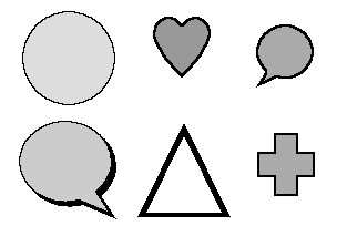
Magic Cap defines class Shape for shapes, decorative viewables that can be drawn as ovals, triangles, hearts, crosses, and a variety of other forms. You can draw shapes using the shape tools in the tool holder. Once a shape is drawn, you can change its type by dropping a shape type coupon from the extras category of the Magic Hat (this category is only available in Magic Cap Simulator).
Shapes are a subclass of viewable that also inherits from HasLineStyle, which provides the ability to change the appearance of the edges of shapes. Shapes add two fields, shapeType and shapeFlags. The shapeType field refers to an object of class ShapeType that describes how to draw the shape, as described in more detail below. The shapeFlags field holds settings for the shape that indicate whether the shape should be drawn rotated and whether the user can draw inside the shape.
The shape's shapeType describes how to draw the shape. When Magic Cap draws the shape, it calls the shape type's ConstructShapePath operation, passing a path object as one of the operation's parameters. ConstructShapePath makes a path that describes the shape, then sets the path parameter to that path.
To create your own shape type, create a subclass of ShapeType and override its ConstructShapePath operation. For example, Magic Cap defines class RectangularShapeType as a subclass of shape type that draws rectangles. Following is the implementation of ConstructShapeType for the rectangular shape type:
Method void
RectangularShapeType_ConstructShapePath
(ObjectID self, const Box *bounds, flags shapeFlags,
	ObjectID path)
	{
	#pragma unused (self,shapeFlags)

	// This shape's path is simply its bounding box

	SetBoxPath(path, bounds);
	}
Rectangular shapes create a path by calling SetBoxPath. If you make your own subclasses of shape types, you'll probably create more complex paths. For more information, see the definition for class Path.
For more information, see the following topics in Magic Cap Class and Method Reference:
class Box
class ChooseOneBox
class ColorBox
fields:
boxSize
colors
class ScrollBox
fields:
bottomArrow
gridOffset
gridSize
maximumSubviewBottom
topArrow
class Panel
class Screen
class ShapeType
operations and attributes:
ConstructShapePath
class Animation
fields:
canBounceHorizontally
canBounceVertically
canFlipHorizontally
canFlipVertically
canRotate
canTouch
canTurnLeft
canTurnRight
cycleDelay
dragAlong
frameDelay
horizontalVelocity
image
inMotion
oneShot
soundTrack
verticalVelocity
class Shape
fields:
shapeFlags
shapeType
class Animal
fields:
animalPatience
behavior
behaviorDelays
behaviorImages
behaviorPeriods
behaviorSpeeds
Book Contents Previous Chapter Next Chapter