


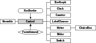
Defined in Control.Def
Inherits from Viewable, HasBorder
Inherits interface from FormElement
Inherits interface from EditsTarget
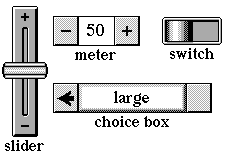
The Control class provides the fundamental features for controls, which are viewable objects that users can touch to make some action happen, or viewable objects that merely display the state of some other object. Meters, switches, sliders, and counters are all examples of controls; they're implemented by subclasses of class Control.
Remember that if the documentation and the software (especially the definition files) disagree, always trust the software.
Class Control is a direct descendent of class Viewable. In addition, Control mixes in class HasBorder, giving controls the features of framed objects. Class Control also implements the interface of class FormElement. The final ancestor of class Control, class EditsTarget, gives controls the ability to change aspects of their targets (thus giving control to controls).
Class Control defines several fields for its objects. Controls include an image that they display and a text style for drawing their labels. Each control retains a value, called its level, that corresponds to its setting as drawn on the screen, and controls also keep track of their minimum and maximum possible values. For example, switches have two possible settings, usually represented by levels of zero and one. (Though not always. It's perfectly legal to have your switch toggle between 0 and 100.)
Sometimes controls have scripts that do something when the user performs the action indicated by the script. Controls are more often connected directly to operate on properties of objects. For example, the User Level choice box in the control room is connected directly to set the system's user level according to the choice box's value; no script is necessary. The object that the control is connected to is called its target. Controls that have scripts have their targets set to nilObject.
Instantiate: rarely
Subclass: sometimes
Call its methods: sometimes
You'll rarely use members of the Control class itself. You're more likely to use members of its subclasses, such as choice boxes, meters, or sliders. There are examples of each of these control types in the Magic Hat. You might create your own subclass of Control if you can't find the kind of control you need in the system.
You'll rarely call any methods of class Control. Usually, you'll just get controls from the Magic Hat and put them in place with their scripts. When you do call methods of class Control, you can read and change the control's value, get or set its target, or work with other attributes.
You can link a control to its target in two ways: you can script the control, or you can edit the target and targetAttribute fields of its definition.
You can name target attributes in two ways: use the name of the attribute or operation prepended by "operation_", or use the attribute number. You can find attribute numbers in the file OperationNumbers.h, but you should probably not use them. Operation numbers are subject to change, and they make your object definition files harder to read.
Here's an example of how you might link a control to its target. Suppose you are creating a set of controls for manipulating animations. You might add a switch with the target attribute "operation_InMotion" and a slider with the target attribute "operation_HorizontalVelocity". (Or you could use the attribute numbers, which would be 707 and 703 respectively.) The target field of both controls would point to the animation object.
Here's an example of a controla rare specimen, since it is an actual Control object, and not a member of a Subclass:
Instance Control 8720;
           next: nilObject;
       previous: (Stamp 9234);
      superview: (GadgetWindow 'Sound Recording Controls' 9226);
        subview: nilObject;
 relativeOrigin: <-90.0,-51.0>;
    contentSize: <64.0,32.0>;
      viewFlags: 0x10081000;
     labelStyle: iSign8;
          color: 0xFF000000;
       altColor: 0xFF00FFFF;
         shadow: nilObject;
          sound: nilObject;
         border: nilObject;
          image: (Image 7947);
      textStyle: nilObject;
   controlFlags: 0x06000000;
          level: 0.0;
            min: 0.0;
            max: 100.0;
         target: iCurrentSoundStamp;
targetAttribute: operation_InputLevel;
End Instance;
This control object monitors the level of a sound input to a sound stamp. The targetAttribute field points to the InputLevel operation of the current sound stamp. That operation returns a Fixed value, which the control uses as its level.
Controls construct a level from the user's input. (How that level is constructed depends entirely on the kind of control it is.) When a control has a new level, it converts the level from a Fixed value to the appropriate attribute type. It uses a public routine called FixedToAttr to convert. The complementary AttrToFixed routine is also available, for converting attribute values to control levels.
The control then calls the attribute setter for its target and the target attribute with the new level. Actually, it calls SetAttribute with the attribute number, which is the equivalent of calling the attribute setter by name. So a control that monitors the attribute Spin of the target targetQuark would call
SetSpin(targetQuark, newControlLevel);
to set the target. To monitor the target, it would call
newControlLevel = Spin(targetQuark);
It's your responsibility to make sure that control levels match to attribute values in a meaningful way. You can do this by setting up your control so that possible level values match attribute values. For example, you wouldn't use a slider to control a Boolean attribute; you'd use a switch. For a "heat" attribute with five named valuesscorching, tropical, tepid, cold, and arctic a choice box with five values might be the most appropriate.
You could also override the attribute setter of your target's class to process new attribute levels.
Class Control defines the following methods:
| Method | Description |
|---|---|
| Getting the control's level | |
| TextFromValue | Convert the given Fixed value to text |
| ValueString | Return the given Fixed value as a string in resultStr |
| Changing the control's level | |
| LevelChanged | Called to let scripts know that control's value has changed; scripts should override this method |
| PushLevel | Set the control's target to reflect changes to the control's level |
| UpdateLevel | Update the control to reflect changes in its target |
| Handling user actions | |
| Action | Handle a tap |
| ActWhen | Return the control's actWhen value; called when deciding when to respond to a user touch |
| BumpValue | Increment the control's level; decrement if decrementFlag is set; framework for controls that have a concept of increment (such as meters) |
| Confirm | Update the target for controls that update on confirmation only |
| Touch | Handle the various kinds of user touches |
| ValueAction | Get the control's valueAction setting |
| ValueMode | Get the control's value mode |
| SetValueMode | Set the control's value mode |
| Getting and setting the control's target | |
| SetAttributeOfTarget | handle targets that are Shared when setting attribute values |
| Drawing the control | |
| AdjustSize | Overridden to consider the control's image and to inset its control box by one pixel |
| Border | Overridden to avoid allowing authoring tools to force showing a border |
| CalcInsidePart | Overridden to call InsideImage if the control has one (and the probe is inside the control's content) |
| CalcOpaqueBox | Overridden to return an empty box if the control has no border |
| Draw | Overridden to draw the control mechanism and the control's image, if it has one |
| DrawControlMechanism | Draw parts of the control other than its value; does nothing by default |
| PartColor | Overridden to return rgbBlack if the part is partImage |
| SetPartColor | Overridden to pass the set call along to the control's image if the part code is partImage, and to set the text color if the part code is partText |
| ValueBox | Overridden to return the content box |
| ValueInContent | Check if the control's value is only displayed in its content box (true for bar graphs, choice boxes, clocks, counters, and meters) |
| ValueInString | Check if the control will only need to be redrawn if its value string changes (true for clocks, counters, and meters) |
| Underpinnings | |
| AboutToShow | Overridden to update the control's level before showing it |
| AboutToHide | Overridden to set the control's level to 0 before it goes offscreen to avoid leaving the control object shadowed in memory |
| CanAcceptCoupon | Overridden to accept sound, image, text style, and orientation coupons |
| CanDrawIn | Overridden to always return false |
| FormData | Overridden to copy the control's level into the form data |
| SetFormData | Overridden to set the control to the level specified by the form data |
| FormDataInfo | Overridden to set the data size to the size of the control's level data |
| Idle | Overridden to update the progress information for controls that set their progress flag and to call SoonerIdle |
| IsFormElement | Overridden to return true if control doesn't have a target attribute |
| OpeningTinkerWindow | Overridden to include the control's image in its tinker window |
| SetImage | Overridden to set the control's image field and mark its content as dirty |
| TextStyle | Overridden to return the control's text style field if the part code is | partContent; otherwise returns inherited |
| SetTextStyle | Overridden to update the control's text style field and redraw the control, if the partCode is partContent |
Whenever you create a subclass of the Control class, you might want to override the following methods:
| Method | When to override |
|---|---|
| Draw | If your control requires special drawing for its image, border, background, or text |
| DrawControlMechanism | If your control needs to display something other than just its value |
| UpdateLevel | If your control should do any processing on a target attribute before using it as a level |
| ValueString | If your control levels require special processing to convert into strings |
The Control class defines the following fields:
| Field | Type | Description |
|---|---|---|
| Inherited from SingleLinkable | ||
| next | Object | Next item in view list |
| Inherited from Linkable | ||
| previous | Object | Previous item in view list |
| Inherited from Viewable | ||
| superview | Viewable | Container for this object |
| subview | Viewable | Object contained by this object |
| relativeOrigin | Dot | Origin relative to superview |
| contentSize | Dot | Size of content rectangle |
| viewFlags | Unsigned | Property settings |
| labelStyle | TextStyle | Text style of object's label |
| color | Color | Color of object's content |
| altColor | Color | Alternative object color |
| shadow | Shadow | Shadow drawn with object |
| sound | Sound | Sound associated with object |
| Inherited from HasBorder | ||
| border | Border | Frame drawn around some control |
| Defined by Control | ||
| image | Image | Image used to draw some control |
| textStyle | TextStyle | Text style used for control's displayed level |
| controlFlags | Unsigned | Various settings for control |
| level | Fixed | Current numerical value of control |
| min | Fixed | Minimum numerical value allowed for control |
| max | Fixed | Maximum numerical value allowed for control |
| target | Object | Object watched and controlled by control |
| targetAttribute | Unsigned | Selected attribute of watched object |
Objects of class Control have the following attributes:
| Attribute | Type | Description |
|---|---|---|
| Level | Fixed | Numeric value of the current level |
| Min | Fixed | Minimum control level |
| Max | Fixed | Maximum control level |
| Fraction | Fixed | (current level) / maximum |
| Percent | Fixed | 100 * (current level) / maximum |
| Digits | UnsignedShort | To be written |
| Editable | Boolean | The value of the editable flag |
| Orientation | UnsignedShort | The value of the orientation flag |
| LevelText | Object | A text version of the control's level |
| Target | Object | The control's target |
| TargetAttribute | Unsigned | The attribute watched or changed by the control |
Use the following flags in the controlFlags field to change the behavior of your control object.
#define controlActWhenMask 0xF0000000
The controlActWhen mask controls which kind of touch the control responds to. Set the "act when" bitfield to one of the following values:
| Name | Value | Meaning |
|---|---|---|
| whenNever | 0 | Control responds to no touches (use for controls that just monitor or for scripted controls) |
| whenTap | 1 | Control responds to taps, when the user's finger first goes down (use >with valuetoggle for switches) |
| whenPress | 2 | Control responds when the user's finger first goes down |
| whenPressing | 3 | Control responds repeatedly while the user is pressing (use with meters and sliders) |
| whenPressed | 4 | Control responds after the user's finger is lifted |
| whenDownOrUp | 5 | Control has a chance to respond once when the user's finger goes down, and once when it comes up |
See the discussion of the Touch method for a description of how controls handle various touch types. The Touch method as defined by class Control handles only the whenNever, whenTap, and whenPressing cases. If you need to handle the other cases, you will have to subclass and override Touch.
#define controlValueActionMask 0x0F000000
The controlValueAction flag sets the way the control's level changes when it's touched. For example, a switch should not behave the same way a slider does, even though they're both controls. Switches would use the valueToggle value action constant, and sliders valueSlider. The TouchAction method relies on the value action setting of the control. (TouchAction is a private method documented later in this section.)
The recognized value action constants are:
| Name | Value | How the level changes on touches |
|---|---|---|
| valueSame | 0 | It doesn't |
| valueMax | 1 | Sets level to maximum |
| valueMin | 2 | Sets level to minimum |
| valueMaxMin | 3 | If actWhen is whenPress, sets level to maximum, otherwise sets it to minimum |
| valueToggle | 4 | Toggles between two values (used by switches) |
| valuePlusMinus | 5 | Increments and decrements levels (used by meters) |
| valueSlider | 6 | Depends on location of touch along control (used by sliders) |
#define updateOnConfirmOnlyMask  0x00010000
#define updateOnConfirmOnlyBit   16
Use this flag if your control should not update its target until Confirm is called.
#define editableMask  0x00008000
#define editableBit   15
Use this flag to distinguish between controls that change their targets and controls that simply monitor their targets. If this bit is set, the control is able to edit its target.
#define hilitePropertyMask  0x00004000
#define hilitePropertyBit       14
This flag is reserved by the system. Please don't use it.
#define hideContainerMask  0x00002000

#define hideContainerBit   13
This flag is reserved by the system. Please don't use it.
#define invertContentMask  0x00000800
#define invertContentBit   11
In older versions of the software, when text could not be drawn in color, this bit was used to invert the color of the control. Since text can now be drawn in color, invertContent is obsolete. You probably don't want to use it.
#define dontSetTargetMask  0x00000400
#define dontSetTargetBit   10
Set this bit if your control shouldn't set its target. SetTarget checks this flag and if it's set, doesn't point the control target
#define useTextwithTargetMask  0x00000200
#define useTextwithTargetBit   9
Set this bit if your control should use the text associated with each level instead of the level itself to set the targeted attribute.
#define updateOnHideMask  0x00000100
#define updateOnHideBit   8
Set this bit to force an update of the target when the control is hidden, even if the control wasn't changed. Choice boxes often use this flag to ensure that some choice is made.
#define reverseSenseMask  0x00000080
#define reverseSenseBit   7
Set this bit to make the AttrToFixed and FixedToAttr methods use the opposite of the control's value (value instead of value) when converting attribute values back and forth to fixed values. This setting is particularly useful with switches for which "on" means the opposite of what the boolean "true" would mean for the target object's attribute.
#define nanMask  0x00000040

#define nanBit   6
"Nan" stands for "not a number". If this bit is set, the control will display differently (in a manner that is yet to be documented) when its current level is not a valid number.
#define convertToMicronsBit 5
Set this bit to convert control levels to microns. When it's set, the FixedToAttr and AttrToFixed public functions convert the control level to microns and vice versa, instead of to the type of the target attribute.
#define dontConvertValueMask 0x00000020
"If set, don't convert attribute to integer." Mysterious, yes. Stay tuned for a more comprehensible description.
#define progressMask  0x00000018
#define progressBit2  4
#define progressBit1  3
When the user should wait for a task to finish before doing more work, the spinning top hat appears on the screen, reassuring the user that their software is grinding away. But some tasks can take place while the user continue to work. How can you reassure him that these tasks are indeed in progress? The progress flag gives you a way to do so.
When the progress flag is used with a bar graph, the tip of the bar graph will flash gray and white, indicating that the system is still chugging along on the given task. One example is the status bar that appears when the user sends or receives maila potentially lengthy task, since it is dependent on network or telephone connections.
#define controlOrientationMask  0x00000007
#define controlOrientationBit3  2
#define controlOrientationBit2  1
#define controlOrientationBit1  0
The control orientation bits contain information about the control's orientation: is it rotated? flipped? These bits are compared to the orientation bit constants, which you can find in the file Utilities.h. For your comfort and convenience, those constants are also listed here:
/* bits of orientation */
#define rotateBit       2
#define hFlipBit        1

#define vFlipBit        0
/* image orientation bitMasks */
#define rotateMask      (1 << rotateBit)
#define hFlipMask       (1 << hFlipBit)
#define vFlipMask       (1 << vFlipBit)
Version note: Class Control defines many methods that provide a framework for the operations of many kinds of control. If you create your own subclass of the Control class, you will want to override some of those methods. Unfortunately, many of those methods are not yet documented here, though you will find some helpful information in the section on the ChoiceBox class.
attribute Level: Fixed, safe
// operation Level: Fixed
// operation SetLevel: Fixed

Call: sometimes
Override: rarely
Call Level to return the current setting of the control's level. The control's level must be between the control's min and max values, inclusive.
Call SetLevel to set the current setting of the control's level to the given value. The control's level must be between the control's min and max values, inclusive.
attribute Fraction: Fixed, safe
// operation Fraction: Fixed
// operation SetFraction(newValue: Fixed); safe

Call: sometimes
Override: rarely
Fraction returns the current control level as a fraction of the maximum level. For example, if the level is 5 and the maximum possible level is 10, Fraction would return 0.5.
SetFraction, given a fraction, sets the control to the corresponding level.
attribute Percent: Fixed, safe
// operation Percent: Fixed
// operation SetPercent(newValue: Fixed); safe

Call: sometimes
 Override: rarely
Call Percent to get the current level of the control as a percentage of the maximum level. Percent (as you might guess) returns the result of a Fraction call multiplied by 100. SetPercent sets the control to the level corresponding with the given percentage.
operation PushLevel(newValue: Fixed), safe

Call: sometimes
Override: rarely
The system calls PushLevel whenever the control should set its target's attribute, such as when the control's value has changed. For example, TouchAction calls PushLevel if, after doing all of its touch-handling gyrations, it decides the control value has changed. (Yes, TouchAction is anthropomorphous, and capable of higher thought and decision making!)
PushLevel converts the control level into an appropriate attribute value, then sets the target attribute. PushLevel does its work as follows: If the update on confirm only bit isn't set, and the control's target exists, PushLevel checks the target attribute. If a target attribute exists, PushLevel converts the new value to an appropriate attribute. It then calls SetAttributeOfTarget to set the target. PushLevel then calls UpdateLevel.
Otherwise, PushLevel just calls SetLevel with the new value.
operation UpdateLevel()

Call: sometimes
Override: rarely
UpdateLevel reads the target attribute from the target object and sets the control level to correspond. If the target field contains a bad object ID (as it would if the target object has been deleted), UpdateLevel replaces the bad object ID with nilObject.
The system calls UpdateLevel whenever the target has changed and the control level should be updated appropriately. For example, PushLevel calls UpdateLevel.
overrides Draw(canvas: Object; clip: Object)

Call: rarely
 Override: sometimes
Draw draws the control, complete with its image and its control mechanism. Draw calls DrawControlMechanism and DrawValueText to do its work.
operation DrawControlMechanism(canvas: Object; clip: Object)

Call: rarelyOverride: sometimes
You should override DrawControlMechanism to draw parts of the control other than just its value. For example, the Meter subclass overrides this method to draw the "next" and "previous" images at either end of a meter, and the boxes that contain them. The basic Control class draws nothing in this method.
overrides AdjustSize()

Call: rarely
Override: rarely
This method matters only to controls that draw themselves with images. AdjustSize determines how large the control's content box should be by checking image sizes.
attribute Orientation: UnsignedShort, safe
//operation Orientation()

Call: rarely
Override: rarely
Orientation returns the current orientation of the control, by checking the control orientation mask. SetOrientation sets the orientation by setting those bits. You will rarely call SetOrientation yourself, but the system calls it when a user drops an orientation coupon on your control.
overrides Touch(touchInput: TouchInput)

Call: rarely
Override: rarely
The Touch method processes the many possible user touches on the control, using the value of the actWhen flag. It calls the TouchAction method when the actWhen value is whenTap, whenPress, whenPressing, whenPressed, or whenDownOrUp. If the actWhen value of the control is whenNever or the value action is valueSlider, Touch calls Action. This call gives scripting a chance at controls that would otherwise do nothing.
Private TouchAction(touchInput: TouchInput, VAR where:
          Dot, when: Short, VAR didPin: Boolean,
          VAR goalMilliseconds: UnsignedLong,
          VAR millisecondDelay: UnsignedLong)

Call: rarely
Override: rarely


  Version note: TouchAction is a private method, but its activities are of interest to you, the subclassing developer, so it will be documented here in a future version
operation ActWhen(): UnsignedShort

Call: rarely
Override: rarely
Touch calls the ActWhen method, which simply returns the value of the bit field of the controlActWhenMask.
operation Action

Call: sometimes
Override: sometimes
Action is called under various circumstances by Touch and TouchAction. Action handles the various value action possibilities of the control. The method as defined by the basic Control class only handles the valueToggle case. If the control is a toggle control, Action toggles the value and then plays the control's sound.
Override Action if your subclass needs to handle other cases.
attribute Min: Fixed, safe
// operation Min: Fixed
// operation SetMin(newValue: Fixed); safe

Call: sometimes
Override: rarely
Call Min to return the minimum allowable setting of the control's value. The control's value must be between the control's min and max values, inclusive.
Call SetMin to set the minimum allowable setting of the control's value to the given value. The control's value must be between the control's min and max values, inclusive.
attribute Max: Fixed, safe
// operation Max: Fixed
// operation SetMax(newValue: Fixed); safe

Call: sometimes
Override: sometimes
Call Max to return the maximum allowable setting of the control's value. The control's value must be between the control's min and max values, inclusive.
Call SetMax to set the maximum allowable setting of the control's value to the given value. The control's value must be between the control's min and max values, inclusive.
Both SetMin and SetMax rely on a private routine, SetMaxMinCommon, which does the following:
If you need to get the maximum level of your control dynamically (say, by getting the length of a list associated with your target), you should override SetMax.
attribute Editable: Boolean, safe
// operation Editable: Boolean
// operation SetEditable(newStatus: Boolean)

Call: sometimes
Override: rarely
Call Editable to check the control flags and get the current value of the editable bit. Call SetEditable to set the editable bit to a new value.
attribute Digits: UnsignedShort, safe
// operation Digits
// operation SetDigits

Call:
Override: