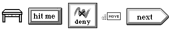
Buttons (top row of objects) and controls
Book Contents Previous Chapter Next Chapter
This chapter describes buttons, viewables that users touch to perform some immediate action, and controls, viewables that allow users to interactively manipulate some setting, displaying information about the setting as users touch. Before reading this chapter, you should be familiar with viewables, stamps, and scenes.
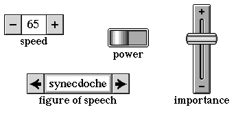
Buttons provide a way for users to perform an action by touching an object on the screen. Similarly, controls allow users to change and observe a particular setting, such as the sound level of the communicator's speaker or a choice from among a list of items. Magic Cap provides various kinds of controls, including switches, meters, and choice boxes.
Buttons (top row of objects) and controls
Buttons and controls are described together in this chapter because the functions they perform are somewhat similar. Because buttons are very simple, while controls are often quite complex, most of the material in this chapter is about controls.
Buttons call their Action operation to perform their function. You can program buttons by creating subclasses of Button and overriding their Action operation, or by writing a Magic Script for them.
Every control maintains a setting called its level. Controls can use their level to set an attribute of a target object, to display one of a chain of images, or to perform some arbitrary function defined by a Magic Script.
Controls can be set to respond to a particular kind of user touch, such as a tap or a touch-and-release action. Controls can also be set to indicate how they should change their level when the user touches, such as by toggling between two values or by incrementing or decrementing their level. Controls include flags you can use to customize their appearance and behavior.
Magic Cap defines various useful subclasses of buttons, including SimpleActionButton, used for buttons that call a single operation, ToolButton, used for buttons that summon tools, and ModeButton, a class of buttons that switch among modes in modal scenes.
Magic Cap defines a number of useful subclasses of control, including Switch, useful for controls that toggle between two positions, class Meter for controls that display their level as text or numbers, and class ChoiceBox for meters that let the user pick an item from a list of possibilities. Choice boxes include a set of flags for customizing the way they work.
Magic Cap defines a class called Gadget that is similar to class Button. You can use class Gadget to create small viewables that make an associated window appear and disappear when the user touches the gadget. Gadgets have flags you can set to fine-tune their appearance and behavior.
Class Button defines a set of basic features for drawing and supporting buttons. You'll probably include some buttons in your package's scenes and windows, and you'll probably declare them in your instance definition files.
Buttons simply call their Action operation when the user touches and releases them. Because the Action operation of buttons does nothing, you must either make a subclass of button and override Action or create a Magic Script for your button and assign it to the button's Action operation to make a button perform a particular function in your package.
Magic Script is most suited if the button's function is relatively simple or if the action is unique to a particular button rather than being generally applicable to several buttons. For more complex or general functions, you should create a subclass of button and override its Action operation, or use one of the provided subclasses of button, such as simple action buttons or mode buttons. If the button's function consists of calling a single operation, you may be able to use a simple action button, described in its own section in this chapter.
Buttons can have two borders, connected in a chain by their next and previous fields. Magic Cap draws the button with the alternate border if the button is highlighted.
Because buttons are designed to perform their action automatically when the user touches, you'll rarely call any operations of buttons.
Class Control defines a set of basic features for drawing controls, connecting controls to their associated objects, and maintaining and displaying their values. You'll probably never declare or use any objects of class Control. Instead, you'll create and use objects defined by subclasses of controls.
You might call some operations of a control to get or set its attributes, but most often you'll simply declare controls in your instance definition files and users will work with them.
Every control maintains a setting called its level. A control's level is a fixed-point number, a 32-bit signed quantity containing an integer part in the high-order word and a fractional part in the low-order word. Magic Cap defines a set of operations of class Math that convert between fixed-point values and integers. Every control includes a minimum and maximum value that define the range for its level.
You can get or set a control's level by using its Level attribute. The level's minimum and maximum values are available with the Min and Max attributes. When a control's level changes, Magic Cap calls the control's LevelChanged operation.
For convenience, you can get or set a control's level in other ways as well. The Fraction attribute expresses the control's level as a fixed-point fraction of the maximum value, and the Percent attribute expresses the control's value as a percentage of the maximum.
Most controls are associated with some other object and use their values to change some attribute of the associated object. Controls provide three ways to implement this association, as follows:
These techniques are described in the following sections.
You can connect the control to another object so that an attribute of the connected object changes to a new value when the control's level changes. The associated attribute and object are called the target attribute and target object.
When you use this technique, the relationship between the control's level and the target attribute is bidirectional. In other words, if the target attribute changes, Magic Cap changes the control's level to reflect the new value of the target; if the control's level changes, Magic Cap changes the target attribute.
Although the relationship is bidirectional, in practice the target attribute is rarely changed directly, and the control is often the only user interface for changing the attribute. If the user copies the control, all copies will be connected to the target, ensuring that all controls with the same target remain accurate.
To use this technique, simply set the control's target and targetAttribute fields to the desired object and attribute, respectively, and don't create a Magic Script for the control. You can also use the Target and TargetAttribute attributes to get and set the target information at runtime.
NOTE: When you declare an attribute in a class definition file, ObjectMaker allocates two operation numbers for the attribute, one to get its value and one to set it. These two operation numbers are always consecutive and the getter is always first. The control's target attribute refers to the operation number for the getter. When the target changes, Magic Cap calls the getter operation specified by the target attribute to update the control. When the control changes, Magic Cap calls the setter operation, specified by adding one to the operation number for the getter. See the Object Runtime chapter of this book for more information on attributes and operations.
Use this technique when you want to monitor or control the value of a specific attribute and object. For example, the volume slider in the general control panel uses this technique to connect to the MasterVolume attribute of the System object.
The target attribute can be any scalar value, including signed long, unsigned long, signed short, unsigned short, signed byte, unsigned byte, boolean, or fixed-point. Magic Cap automatically converts between the control's level, a fixed-point value, and the type of the target attribute.
If your control is connected to a target attribute that contains a text object, set the control's useTextWithTargetBit in its controlFlags field. Magic Cap will then automatically convert between the control's level, a fixed-point value, and the target text object.
If your control is connected to a target attribute of type Micron, set the control's convertToMicronsBit in its controlFlags field. Magic Cap will then automatically convert between the control's level, a fixed-point value, and the target value, which is expressed in microns.
When the control's level changes and the control is connected to a target, Magic Cap calls PushLevel to set the target attribute to the control's new level. If the control's updateOnConfirmOnlyBit in its controlFlags field is set, PushLevel doesn't set the target attribute when the control's level changes. In this case, the target attribute is only set when the control's Confirm operation is called. Magic Cap doesn't call Confirm, so you can use the updateOnConfirmOnlyBit to restrict when the target attribute is updated.
When the target attribute changes, Magic Cap calls UpdateLevel to set the control's level to the attribute's value. If the control's updateOnConfirmOnlyBit in its controlFlags field is set, UpdateLevel doesn't set the control's level when the target attribute changes. In this case, the control's level is only set when the control's Confirm operation is called. Magic Cap doesn't call Confirm, so you can use the updateOnConfirmOnlyBit to restrict when the control's level is updated by its target.
If your control subclass defines a different way to set its level from its target, you should override UpdateLevel to set the control's level appropriately when its target changes.
If you want your control simply to display the value of its target attribute, never changing the target, you can call SetEditable (false) on the control, or set the editableBit flag to false in the control's instance definition. The targets of controls with their editableBit set to false are never changed by the controls.
You can create a Magic Script that allows the control to perform any scriptable action when the control's level changes.
To use this technique, create a Magic Script for the control's LevelChanged operation and set the control's target object to nilObject. Use this technique when you want your control to perform an action that is more complex than simply monitoring or controlling the value of an attribute.
If a control has a Magic Script for its LevelChanged operation and a non-nilObject target object and target attribute, the control both changes the associated attribute and executes the script.
You can create a control that monitors a target object and attribute and uses its level to choose one of a chain of images. The control chooses the (n+1)th image in the chain, where n is the control's level. For example, level 0 selects the first image, level 1 the second, and so on.
To use this technique, create a chain of images connected by their next and previous fields. Set the control's image field to refer to the desired image in the chain, and set the control's target object and target attribute to the desired values. Don't create a Magic Script for the control. When the target attribute changes, Magic Cap will redraw the control with the image that corresponds to its new level.
Use this technique when you want a control that monitors an object's attribute and draws itself using one of a set of images. For example, the sound recording window uses this technique for its recording level display, as shown in the following figure.

Sound recording window
Some control subclasses also use this technique. For example, switches have two images, one for off and one for on, by default corresponding to levels 0 and 1. When the switch is off, its level is 0, and the switch is drawn with its first image. When the switch is on, its level is 1, and the switch is drawn with its second image.
When the user touches a control, the control determines whether the touch is one that should change the control's level or not. If so, the control further determines how the user's touch should affect its level.
Each control has an action touch setting that determines which kinds of touches it responds to. Controls can have the following action touch settings:
-------------------------------------------------------------------------------------------------------------
action touch  description
-------------------------------------------------------------------------------------------------------------
tap or press  Respond when user's touch begins (that is, before the touch is released). This setting is used
              for switches.
pressing      Respond continuously while the user is maintaining the touch. This setting is used for meters,
              choice boxes, and sliders.
pressed       Respond after user has released the touch. This setting can be used for switches that should
              not change levels until the user releases the touch.
down or up    Respond when user begins to touch, and respond again after user has released the touch. This
              setting can be used for switches that should act like buttons, changing states when the user
              touches and releases.
none          Don't respond to any touches. This setting is used for controls that only monitor values and
              don't allow them to be changed, such as the sound level meter in the Sound recording window.

-------------------------------------------------------------------------------------------------------------
You set the control's action touch by using the flags defined by controlActWhenMask in the control's controlFlags field in its instance definition. You can get the control's action touch setting by calling its ActWhen operation. Magic Cap does not provide an operation to change the control's action touch setting directly at runtime.
Each control ignores touches other than those specified by its action touch setting. In addition, each control has a level action setting that indicates how its level changes when the user touches it with the action touch. Controls can have the following level action settings:
--------------------------------------------------------------------------------------------------------------
level action            description
--------------------------------------------------------------------------------------------------------------
toggle                  If the control's level is greater than its minimum, set the level to its minimum.
                        Otherwise, set the level to its maximum. This setting is used for switches.
increment or decrement  If the touch is in the plus or minus part of a meter, increment or decrement the
                        control. This setting is used for choice boxes and meters.
vary continuously       Set the control's level according to the position on the control where the user
                        touched. This setting is used for sliders.
none                    Don't change the level when the user touches. This setting is rarely used.
set maximum             Set the control's level to its maximum when the user touches. This setting is rarely
                        used.
set minimum             Set the control's level to its minimum when the user touches. This setting is rarely
                        used.
set maximum or minimum  If the user presses, set the control's level to its maximum. Otherwise, set the level
                        to its minimum. This setting is rarely used.

--------------------------------------------------------------------------------------------------------------
You set the control's level action by using the flags defined by controlValueActionMask in the control's controlFlags field in its instance definition. You can get the control's level action setting by calling its ValueAction operation. There's no way to change the control's level action setting directly at runtime.
You specify the action touch and value action settings in the controlFlags field when you declare controls in your instance definition files. For more information on control flags, see the Declaring Instances of Buttons and Controls section of this chapter.
When the control is removed from the screen and Magic Cap calls its AboutToHide operation, the control updates its target if the control's updateOnHideBit is set in the controlFlags field. You can set this flag to ensure that the target is set even if the user hasn't changed the level of the control. For example, choice boxes often set this flag to ensure that the target is set, even if the user didn't explicitly choose an item from the list.
If your control is connected to a boolean attribute and you want to set the target to the inverse of the level, set the reverseSenseBit in the controlFlags field. This flag is most useful for switches. For example, the faster switch in the Find window, which indicates whether the search dog should walk around the screen while searching, is connected to the search dog's ShouldWalk attribute, and the switch's reverseSenseBit is set. If the switch is on, the attribute is set to false, and if the switch is off, the attribute is set to true.
If your control displays its level numerically, as meters do, and you attempt to set the level to 0x80000000, an illegal value, Magic Cap sets the control's nanBit in the controlFlags field. The nanBit indicates that the level is the standard numeric value NAN (not a number), used for illegal values. When the control has this level, it displays two dashes instead of a value.
If you put a control in a form, the control automatically works as a dynamic form element; that is, the control keeps track of a separate setting for every card that uses the form. For more information on form elements, see the Cards, Stacks, and Forms chapter of this book.
Controls usually display their levels centered in their content boxes. However, some controls display other information in addition to their levels. For example, choice boxes have arrows that allow the user to see other choices. If you create a subclass of control that displays other information in addition to the level, you can override ValueBox to return the box that should display the control's level.
When Magic Cap draws a control, it calls the control's DrawControlMechanism operation to draw the parts of the control other than the part that displays the level, such as the plus sign (+) and minus sign (-) areas of a meter or the arrows in a choice box. You can override DrawControlMechanism in your control subclass if you want to customize the appearance of the part of the control that doesn't display the level.
This section describes several common subclasses of button that you might use in your packages.
Instances of class Button call their Action operation when the user touches and releases them. To make a button that performs some function, you must either create a Magic Script for the button or make a subclass that overrides its Action operation. Because simple action buttons provide an easy implementation for a common way of using buttons, you're likely to use them in your packages.
Magic Cap defines class SimpleActionButton for buttons that perform a single operation when touched. Simple action buttons add a target object and target operation to buttons. When the user touches and releases a simple action button, the target operation is performed on the target object. The target operation must take no parameters. For example, the new button in the notebook scene is a simple action button. This button's target object is the notebook scene, and its target operation is EditNewCard, which creates a new page for the notebook.
Simple action buttons normally perform their function when the user touches, then releases the button. To set a simple action button to perform its function as soon as the user touches, without waiting for the touch to be released, add the value kOperationOptionMask to the target operation number.
Magic Cap provides class ToolButton as a convenient subclass of button designed to summon a tool. Tool buttons usually appear grouped together inside a window labeled Tools that springs from the tool gadget on the control bar.

Tool buttons
When the user touches and releases a tool button, the button's image hops to the tool gadget's position on the control bar (the third slot from the right) and the tool associated with the button becomes the current tool. The tool button's tool field refers to its tool. When the user touches and releases the tool button, the tool button's Action operation calls MakeViewable on the tool to create a viewable that has the tool's image, then hops that viewable to the tool gadget's position on the control bar.
For information on what happens when the user touches with various tools, see the Viewables and Touching chapter of this book. For information on making your own tools, see the Miscellany sample provided with CodeWarrior Magic.
Magic Cap defines class ModeButton for buttons that are used to switch among modes in a modal scene. For example, in the phone scene, the buttons on the right side are all mode buttons. When the user touches one, the corresponding mode of the phone scene appears.
Every mode button has a target and a mode value. The target is the modal scene that is associated with the button. When the user touches and releases the button, Magic Cap goes to the target scene and calls SetViewMode on the target, which in turn calls GoToCardNum on the mode value.
You can use mode buttons with a target that is not a modal scene, but is some other subclass that you create. In this case, your scene subclass should declare attribute ViewMode and override SetViewMode to display the appropriate mode when the user touches a mode button.
This section describes several common subclasses of control that you might use in your packages.
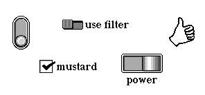
Magic Cap defines class Switch as a subclass of controls. Switches have two levels, specified by their maximum and minimum. When the user touches a switch, it toggles its level from maximum to minimum or minimum to maximum.
Switches
Switches work by setting their action touch to respond on the user's tap or press and their level action to toggle the switch's value. When the switch's level is its maximum, the switch is on. When the level is the minimum, the switch is off. Switches display one of a view chain of two images to indicate their state. If the switch is off, the first image in the view chain is displayed, and if the switch is on, the second image in the view chain is displayed.
Class Switch is virtually identical to class Control. The only additional operation defined by switches is IsOn, which you can call to determine if the switch is on.
Magic Cap defines class Meter as a subclass of controls. Meters indicate their levels by displaying text or appropriate images. Meters provide a way for users to change their level, usually a pair of areas that increase or decrease the level when the user touches. The following figure shows some example meters, including choice boxes, which are instances of a subclass of meter.

Meters
When the user touches the part of the meter that increases the level, usually a small plus sign (+) or forward-pointing arrow, the meter increases its level, up to the maximum. Meters have a corresponding part, usually a small minus sign (-) or backward-pointing arrow, for decreasing the meter's level.
Instances of class Meter always display their level, which is always a number. They don't use their image field. Subclasses of meter can use their level to display other values. For example, choice boxes use their level to select an item from a list, then display that item.
Meters use their upDownImages field to refer to a pair of images that are used to draw the parts that increase or decease the value. The + image is iPlusSign, which refers in turn to the corresponding - image via its next field. Class Meter overrides DrawControlMechanism to draw these images. Your meters should refer to iPlusSign in their image field. Choice boxes use a different value. See the Choice Boxes section in this chapter for more information.
If the level is already at the minimum or maximum, the level can only be changed in one direction, so the sign or arrow that can't be used is not drawn. You can create a subclass of meter that allows the user to move directly from the maximum value to the minimum, or from the minimum to the maximum, always drawing the increment and decrement images. Continuing this way through the levels is called wrapping because the values seem to wrap around the extremes, from one to the other. To implement wrapping, override ControlsWrap in your meter subclass to return true. For example, choice boxes use this technique to implement wrapping. You should enable wrapping only for values that are not numeric or otherwise strongly ordered.
Magic Cap calls the control's BumpValue operation to determine how much to change the level for each touch. By default, touching these parts of a control changes the level by 1. If the option key is down while touching, the level changes by 10. You can override BumpValue to change these values. For example, choice boxes override BumpValue to ensure that option-tapping their level-changing parts always shows the first or last choice.
Meters provides a way for you to temporarily prevent users from changing the level of the meter directly. You can override ControlsActive to disable your meters, removing the increment and decrement images and preventing users from changing their values. Choice boxes use this operation to prevent users from using the increment and decrement images while the choice box's full list of choices is shown in a list window, as shown in the following figure.
Choice boxes hide arrows when all choices are shown
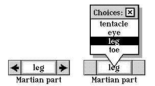
Magic Cap defines class ChoiceBox for meters that are associated with a set of possible values. Choice boxes provide a way for users to select from among the set of values by using arrows to look through them one at a time or by seeing the entire set at once and selecting an entry.
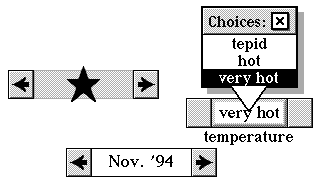
Choice boxes
The choices displayed by the choice box can be strings of text or viewables. You declare the choices in your instance definition file. You can get and set the choices at runtime by using the Choices attribute. If the choices are all text strings, the Choices attribute returns a text object containing each choice followed by an ASCII 0x0A character. If the choices are viewables, Choices returns an object list that refers to the viewable choices. The choice box draws the text or viewable that corresponds to the choice box's current level.
To use a set of viewables as choices, set the choiceObjects flag in the choice box's choiceFlags field in your instance definition file. If the choiceObjects flag isn't set, the choice box will use a single text object for the choices. The text object consists of the each choice followed by an ASCII 0x0A character.
Some choice boxes have choices that depend on information that is only available at the time the choice box is about to appear on the screen. For example, when the user touches the fax button in the Magic Lamp, the fax window includes a choice box with selections for what to fax. This list of choices varies depending on the current card and scene and is assembled just before the choice box appears.

Choice box in fax window
Choice boxes use transient choice lists to create and manage dynamic lists of choices. Transient choice lists are choices that are created dynamically when the choice box is about to be shown. If a choice box uses a transient choice list, it builds the choice list by calling a specified operation when the choice box is about to appear on the screen. When the choice box is about to disappear from the screen, the choice list is destroyed, leaving the choice box's Choices attribute set to nilObject when the choice box isn't on the screen.
When a choice box has a transient choice list, it uses its Target and TargetAttribute to refer to the operation that it calls to set up the choice list. The target attribute is really not an attribute, but an operation, and the target is the object that implements the operation. In this case, the target sets up the control's choice list, not its level.
The transientChoices flag in the choiceFlags field indicates that the choice box uses transient choices. If this flag is set, Magic Cap assumes the choice box's TargetAttribute is actually an operation that returns an object list of choices. This is the operation that Magic Cap calls to get the choice list when the choice box is about to appear on the screen. For example, when the user touches the fax button in the Magic Lamp, the choice box in the fax window calls the scene's MakeFaxContentList operation, which returns an object list of choices for the choice box.
If you set up your choice box to use transient choices, there are several other flags you'll usually set in the choiceFlags field in addition to transientChoices. These flags are resetValue, choiceObjects, useObjectIndex, and maxFromChoices. The resetValue flag ensures that the choice box's level is reset to its minimum when the choice box disappears after use. You must set the choiceObjects flag if the choices are viewables and not text strings. The useObjectIndex flag sets the level according to the ordinal number of the current choice. The maxFromChoices flag instructs the choice box to return the number of choices as its maximum level, rather than returning the value of its maximum field.
If your choice box contains text items, you can provide a way for the user to change the text of the last choice in the list. To do this, include a text field object as a subview of your choice box. Set the last choice to other or some similar text to indicate that it can be changed, and set the lastOneEditable flag in the choiceFlags field.
If you set the lastOneEditable flag, when the user displays the last choice, the text field will appear and its contents will be selected for editing. If the user touches the center of the choice box to display the list of choices, the last one will always appear as other, no matter what you specified for the initial choice or the user has changed it to.
You can also construct a choice box which has none as its uneditable last choice. Use an object of class ComputedChoiceBox for this purpose. See the Computed Choice Boxes section in this chapter for more information.
If you change the choices directly, without calling SetChoices to change the Choices attribute, you should call UpdateChoices to ask the choice box to redraw itself.
When the choice box first appears on the screen, it displays text or a viewable that indicates its level. Normally, its level is set to the value of its target attribute. If you want Magic Cap to reset the choice box's level to its minimum before it appears on the screen, set the resetValue flags in the choiceFlags field. This flag is most often used in conjunction with transient choice lists, as described in the Transient Choice Lists section of this chapter.
Choice boxes display arrows at their left and right edges. The user touches these arrows to move through the choices one at a time. When the user reaches the first or last choice, the appropriate arrow disappears, indicating that there are no more choices in that direction. You can set your choice box to wrap, always drawing both arrows even when showing the first or last choice and allowing the user to move directly from the last choice to the first or from the first to the last. To allow your choice box to wrap, set its choiceWrap flag in the choiceFlags field.
Choice boxes normally adjust their width to accommodate the longest choice. You can prevent the choice box from changing its width to handle the largest choice by setting its neverAdjustBoxSize flag in the choiceFlags field. If you set this flag and the longest choice doesn't fit in the box, it will be drawn truncated and with ellipses. You'll usually declare choice boxes that are big enough to accommodate their largest choice, and this flag will only be used if the user adds a new choice by dropping a text coupon on the choice box.
When the user touches the current item itself rather than one of the arrows, the choice box displays all the choices in a list window. You can determine if the choice box's list window is showing by calling MenuShowing.
You can call LevelText to get a text object that corresponds to the choice box's level. If the choices are text strings, LevelText returns the text for the current choice. If the choices are viewables, LevelText returns a text object containing the number of the current level. You can also call SetLevelText to change the level. If the choice box uses an object list of viewables for its choices, you can use the Selected attribute to get and set the current choice.
If your choice box's target is a numeric attribute and the choices are text objects consisting of numbers, you should set the numericText flag in the choiceFlags field to make Magic Cap automatically convert the text to a numeric value when it updates the target.
Usually, choice boxes are set up to set the target attribute to the choice that corresponds to the choice box's level. You can also set the useObjectAttribute flag in the choiceFlags field to have your choice box set its target attribute according to that same attribute of the current choice. For example, the face choice box in the Text style window sets its target, the style of a text object, according to the style of the current choice. The choice box calls TargetAttribute on the choice to get this value.
For more information on using the choiceFlags field to customize the behavior of choice boxes, see the Declaring Instances of Buttons and Controls section of this chapter.
Magic Cap defines class ComputedChoiceBox for choice boxes that maintain a list of choices, but perform some transformation on the list before appearing on the screen. Computed choice boxes allow you to do some processing on the choices before showing the choice box.
Class ComputedChoiceBox itself can perform only one transformation on its choice lists. You can create subclasses of ComputedChoiceBox to define additional transformations.
Instances of ComputedChoiceBox can perform only one transformation on their choice lists: they can add none as the last choice. For example, when the user enters a work phone number and extension in the name cards file, Magic Cap displays a computed choice box for the user to enter the location from which the extension should be used. This choice box includes all the locations the user has entered, plus none as the last choice. To have your computed choice box add none as its last choice, set its transformationType field to the value transformAddNoneToList.
When you create a computed choice box, its transformObject field refers to the object list that contains the initial choices for the choice box, before the final none choice is added.
Computed choice boxes work by calling their ComputeChoices operation when they are about to appear on the screen. To add additional kinds of transformations for computed choice boxes, create a subclass of ComputedChoiceBox and override ComputeChoices to perform some other transformations. You can use the transformationType field to define additional transformations and the transformObject field for any object that you use to create the computed list of choices.
Magic Cap defines class Gadget for viewables that summon and dismiss windows when touched. When the user touches and releases a gadget, its associated window appears on the screen (or disappears if it's already on the screen). Gadget windows point to their gadgets to remind the user how they were opened and how to close them.

Gadget and gadget window
Class Gadget is a subclass of Stamp. Every gadget has a target, referred to by its Target attribute, that appears or disappears when the user touches and releases the gadget. The target is usually a gadget window, although it can be any viewable.
Every gadget has a set of flags in its flags field that you can use to customize its behavior. If you set the gadget's swallowFlag, the gadget will swallow viewables that the user drops on it. The tote bag and trash use this flag to swallow objects.
You can set the gadget's pullOutFlag to allow the user to pull an item out of the gadget's window by sliding from the gadget. The tote bag and trash also use this flag. If you set the gadget's pullOutCopyFlag, the user can pull out a copy of an item in the gadget's window by holding down the option key while sliding out of the gadget. The tote bag sets this flag to enable this feature, while the trash prevents this form of copying by keeping this flag clear.
You can set your gadget to change its image to show whether its gadget window is empty or has contents. If the gadget's showOccupiedFlag is set and its image field refers to a pair of images connected in a view chain, Magic Cap will draw the first image for the gadget if its window is empty, and the second image if the gadget's window has any contents. The tote bag and trash gadgets use this feature to show when their gadget windows contain something.
Many of Magic Cap's gadgets are on the control bar. When the user touches a gadget in the control bar, it highlights by inverting the slot it's in. If you make your own gadgets that aren't on the control bar, they will normally highlight by inverting their image. You can set a gadget's useStarburstFlag to make it use the starburst highlighting effect instead. Note that this flag has no effect on gadgets in the control bar, because the control bar inhibits starburst highlighting by overriding its ContentsCanHilite operation to always return false.
When the user touches a gadget to make its target appear, Magic Cap sets the target to refer to the gadget via the target's own Target attribute. If you want to preserve the target's Target attribute and prevent Magic Cap from changing this attribute, set the gadget's dontSetTargetFlag.
This section describes flags used by controls and choice boxes, as well as system indexicals that contain useful buttons, controls, and related objects. Specifically, the flags can be used in the controlFlags field of controls and in the choiceFlags field of choice boxes.
Class Control defines various flags you can use to customize the appearance and behavior of its members. You'll use these flags primarily when you declare controls in instance definition files. These flags are mainly used by Magic Cap itself to provide various system features. You'll rarely need to test control flags at runtime, so most flags do not provide operations to test or set them at runtime. Instead, you must access them directly in the control's controlFlags field.
Controls define the following flags:
#define controlActWhenMask      0xF0000000
	/* 4-bit field set to indicate control's action touch */
#define whenNever               0
	/* if set, doesn't respond to touches */
#define whenTap                 1
	/* if set, responds when user's touch begins */
#define whenPress               2
	/* if set, responds when user's touch begins */
#define whenPressing            3
	/* if set, responds continuously while touching */
#define whenPressed             4
	/* if set, responds after user's touch ends */
#define whenDownOrUp            5
	/* if set, responds when touch begins and
		again when it ends */

#define controlValueActionMask      0x0F000000
	/* 4-bit field set to indicate control's level action */
#define valueSame             0
	/* if set, level isn't changed on touch */
#define valueMax              1
	/* if set, level is set to maximum on touch */
#define valueMin              2
	/* if set, level is set to minimum on touch */
#define valueMaxMin           3
	/* if set: if user presses, level is set to maximum;
		otherwise level is set to minimum */
#define valueToggle           4
	/* if set, level toggles between minimum and maximum */
#define valuePlusMinus        5
	/* if set and user touches in appropriate part,
		level is incremented or decremented */
#define valueSlider           6
	/* if set, level is set according to position of touch */

#define updateOnConfirmOnlyBit     16
#define updateOnConfirmOnlyMask    0x00010000
	/* if set, target isn't updated until Confirm is called */

#define editableBit             15
#define editableMask            0x00008000
	/* if set, control can change its target */

#define hilitePropertyBit       14
	/* reserved: should always be zero */

#define hideContainerBit        13
	/* reserved: should always be zero*/

#define invertContentBit        11
	/* reserved: should always be zero */

#define dontSetTargetBit        10
#define dontSetTargetMask       0x00000400
	/* if set, control won't call SetTarget */

#define useTextwithTargetBit    9
#define useTextwithTargetMask   0x00000200
	/* if set, target will be set with text instead of level */

#define updateOnHideBit         8
#define updateOnHideMask        0x00000100
	/* if set, target will always be updated in AboutToHide
	even if level hasn't changed */

#define reverseSenseBit         7
#define reverseSenseMask        0x00000080
	/* if set and boolean target, target is set to
	inverse of level */

#define nanBit                  6
#define nanMask                 0x00000040
	/* set by Magic Cap when level is invalid (not a number) */

#define convertToMicronsBit     5
	/* if set, level is converted to microns for target */

#define progressBit2            4
#define progressBit1            3
#define progressMask            0x00000018
	/* bar graphs: Magic Cap uses to flash tip of graph in status announcement */

#define controlOrientationBit3  2
#define controlOrientationBit2  1
#define controlOrientationBit1  0
#define controlOrientationMask  0x00000007
	/* set these to draw control rotated on screen */
Choice boxes define the following flags:
#define lastOneEditableMask 	0x40000000
	/* if set, last choice is editable text field */

#define resetValueMask		0x20000000
	/* if set, level is set to minimum when it appears */

#define transientChoicesMask	0x10000000
	/* if set, choice list is built by calling operation
		specified by target attribute */

#define choiceObjectsMask	0x08000000
	/* if set, choices are objects and not text */

#define useObjectIndexMask	0x02000000
	/* if set, use index of object as current value */

#define choiceWrapMask		0x01000000
	/* if set, choices wrap around instead of pinning */

#define maxFromChoicesMask	0x00800000
	/* if set, maximum is number of choices */

#define useObjectAttributeMask	0x00400000
	/* if set, use target attribute of selected object as current value */

#define cbMatchWithSameChoice	0x00200000
	/* if set, use IsSameChoice to compare choice list elements with attribute from target */

#define neverAdjustBoxSizeMask	0x00100000
	/* if set, don't allow AdjustSize to change choice box bounds */

#define cbLookForGroupMask	0x00080000
	/* reserved for use by class PeopleList */

#define numericTextMask		0x00001000
	/* if set, convert choice list text to numeric attribute */
For more information, see these topics in Magic Cap Class and Method Reference:
class Button
operations and attributes:
Action
class Control
operations and attributes:
ActWhen
Confirm
DrawControlMechanism
Fraction
Level
LevelChanged
Max
Min
Percent
PushLevel
SetEditable
Target
TargetAttribute
UpdateLevel
ValueAction
ValueBox
fields:
controlFlags
image
target
targetAttribute
flags:
controlActWhenMask
controlValueActionMask
convertToMicronsBit
editableBit
nanBit
reverseSenseBit
updateOnConfirmOnlyBit
updateOnHideBit
useTextWithTargetBit
class SimpleActionButton
operations and attributes:
Action
class ToolButton
fields:
tool
class ModeButton
class Gadget
operations and attributes:
Target
flags:
dontSetTargetFlag
pullOutCopyFlag
pullOutFlag
showOccupiedFlag
swallowFlag
useStarburstFlag
class Switch
operations and attributes:
IsOn
class Meter
operations and attributes:
BumpValue
ControlsActive
ControlsWrap
fields:
UpDownImages
class ChoiceBox
operations and attributes:
Choices
LevelText
MenuShowing
Selected
SetChoices
SetLevelText
UpdateChoices
fields:
choiceFlags
flags:
choiceObjects
choiceWrap
lastOneEditable
maxFromChoices
neverAdjustBoxSize
numericText
resetValue
transientChoices
useObjectAttribute
useObjectIndex
class ComputedChoiceBox
operations and attributes:
ComputeChoices
field:
transformationType
transformObject
class Math
Book Contents Previous Chapter Next Chapter